In my last post I went over how I created tectonic plates in the map and used them to create geological provinces. With this basis we can move onto adding more life and character into the map. In this post I will go over adding elevation, rivers, moisture, and temperature. With all this new information we can then determine what type of biome is on each tile. Elevation, rivers, and biomes are the three big pieces of information that give character to a map and environment. These features help to break apart the map into more logical provinces. Often biomes, rives, and mountain ranges provide safe places or barriers from other peoples and can create divides for different peoples and cultures. However I am getting ahead of my self, political provinces are something that will hopefully be implemented further on. First I must disclose that many of the concepts here are taken from
Amit's Island Generator Tutorial, and I am just adding my own twist in some areas to fit my own needs. I will go over the parts that I added in detail but am going to skip over many of the features that are taken from his tutorial. If you are interested in how those portions are done, I highly recommend you take a look if you haven't already.
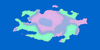 |
| Geological Provinces - Green: Orogen, Blue:Basin, Pink: Craton |
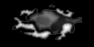 |
| Elevation Map - Black: Low, White: High |
To get started we can take a look at elevation. We start with the geological provinces map that we created from the previous post and use it as the basis for generating the elevations. I did make two changes to the geological provinces generation since the last post. I made divergent land boundaries into basins, and I added a bit more noise to the shape of orogen boundaries. This helped to add a little more variety to the map . The goal for the elevations is to have the mountains to have the highest elevations and the basins to have the lowest elevations. As described in
Amit's demo, the elevation is determined by the distance from the coast, with a slight twist however. We can use two different step values. A large step value was used for mountains (green tiles) and a medium step value was used for the craton tiles (pink tiles). Another thing to note is that lakes were pre-placed prior to the generation of the geological provinces so we have two options for dealing with this. We could either change the elevation and recalculate the lakes later, or take lake into account for the elevation. I did the latter for several reasons. I thought is was an easier approach because it didn't backtrack to things that we already calculated and that lake features could help to add variety in mountain regions. That being said, lakes were also treated like basins (blue regions), so they did not factor into increasing the elevation. Taking this approach goes along with Amit's implementation of elevations, in that there are no local minima where rivers could get stuck. This is highly beneficial for the next section. In the end, the elevation map looks quite similar to the geological provinces map, which was the goal.
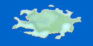 |
| Generic Map With Rivers - Lighter regions indicate elevation |
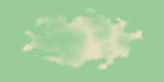 |
| Moisture Map - Green: High, Tan: Low |
Now, I didn't do anything fun and cool with river and moisture calculations, so if you are interested in how the following was done
check it out. I completely used Amit's implementation. I think it is sufficient for an interesting looking map, but it definitely has its drawbacks. It is very obviously one of those ontogenetic (top down) approaches to map generation. Where he does not follow actual geologic processes and is just interested in a way to achieve rivers. One approach to a more realistic moisture pattern would be to add weather or wind patterns and calculate the moisture from lakes and oceans, and the determine where rivers would flow given that information. Quite frankly every approach I have seen that does this gets nitty and gritty quickly. It might be something to add in the future. But the current approach is good enough to use for now and allows me to move on to more interesting things in much less time. A quick explanation is that random points are picked for the river starting locations, and rivers flow from there until they reach the ocean. From that, the moisture is calculated as the distance from a fresh water source (river or lake). Rivers tend to flow through basin regions and at the base of mountains due to the basins being the lowest elevations. The rivers might be hard to see as these small picture, but if you click on them you can enlarge them to see the rivers better.
Next we move onto temperature. Looking at an average temperature map you can see what you would expect. It is hot at the equator and cold at the poles. Now this is not hard to replicate. With a little math we can get there. With each point on the map we have an x and y position (which we will normalize to a range from 0 - 1 for better looking math). If we want a curve with a warm patch in the middle we can just use the function,
\(T(x, y) = 1 - |cos(2π*y)|\)
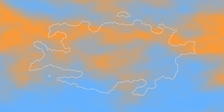 |
| Temperature Map - Orange: High, Blue: Low |
We want the cosine like function in the y direction for one period.First we take the absolute value to give us a nice hard streak in the middle, but we also need to get the inverse of this value to have 1 (warm) in the middle and 0 (cold) on the outside. Now this is great if we are creating the whole world, but we just want portion of the map where our island / continent lies. To do this we must have the ability to tune our equation for a more random temperature outcome. To do this we can add two parameters, a and b, which can adjust the period (transformation), and the starting position (translation). This leaves us with the following,
\(T(x, y) = 1 - |cos(2π * y * a + b)|\)
This gives us a nice looking band of warm/cool weather somewhere on the map. One thing to note is that I skewed the b value towards the center because we took the absolute value of the cosine function. This gives a better distribution of warm and cold temperature zones. This is a good start for general temperatures, however the results are rather bland and predictable results. Nature does not behave so perfectly, it has twists and turns depending on many local factors and weather patterns. Now we can use
procedural texture generation techniques here to help fudge those weather patterns for us. By adding turbulence to our function we can add more organic looking features to our temperature map. Turbulence is just slight alterations in the temperature function according to another noise function. This allows the alterations to look like they are behaving according to a pattern. Therefore it adds coherent randomness to our temperature map. Adding in our turbulence (or noise) function we get the resulting equation,
\(T(x, y) = 1 - |cos( 2π * y * a + b + turbulence(x, y) )|\)
One last touch we can add for temperature is that at higher elevations, we want a colder temperature. We can just have a bias so that at higher elevations, temperature has less effect. Then we are left with a much more organic looking temperature map. Now I did add one bit more to the temperature function. I added an x period. I made it random and extremely small, just to add a bit more randomness to the function.
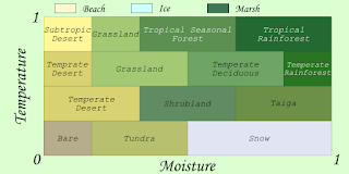 |
| Modified Whittaker Diagram |
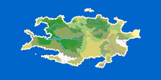 |
| Biome Map: Biome Labels from Whittaker Diagram |
Now we have all the information to fully breath life into our map. We have our elevation, temperature, and moisture all set up. From here we can start to create biomes on the map. We can do this using
Whittaker's diagram. Whittager's diagram is a relationship of the moisture and temperatures on biomes in the real world. On our map we create temperatures and moistures from 0 to 1. When compared to Whittaker's diagram which seems to be missing half of those measurements (because those conditions can't exist because of how much moisture air can carry at different temperatures). In typical procedural generation fashion we fudge the numbers. We use Whittaker's diagram as a guide for where biomes should appear, and then go from there to create a diagram that fits our needs. Using the new table, we can go through our map and place biomes. I also have a couple of special cases that do not adhere to Whittaker's diagram. Ocean, coast, and lake tiles are all exempt. Ocean is ocean, coast is a beach, and like tiles can be one of three things. If a lake is extremely hot, it is a marsh, if it is extremely cold, it is ice, otherwise it is just an ordinary lake. After adding biomes, the map is starting to look like something that can actually be inhabited.
From here my next step is to render the map in 3D. Right now the map looks flat as all hell, because you can either look at a map that shows the elevations and basic information, or the biome map. The rendered map will be a good first step to creating a map that conveys a large amount of information, and is legible. I also want to look into better ways to generate land. Currently, the perlin island generator is not horrible, but I want more variety out of islands. My continent generation function is simple and abysmal, and I need to find a better way of generating more than one island, and not have them just be small clusters of islands.


No comments:
Post a Comment